Fresh off the All-star break and all of the feel-bad-then-good John Scott stories that came with it, I went searching for my next NHL fix. What game am I going to watch when the regular season continues tomorrow?
Low and behold, it looks like the NHL have been hard at work over the weekend to switch over to a brand new site today. So, here’s my thought timeline for my initial usage of the new site, remember, I’m a QA Analyst by day, and a UX enthusiast and hockey fan in my spare time all the time.
-
Looks great!
Things are clear, I like the predominant white color as opposed to the old black. The menu items are clearer. The current/upcoming games are highly visible. Gone are the seldom used team page links. All looks good so far!
-
Am I logged in?

Much easier to fiind than before. But am I logged in? The account link is much easier to find, and it looks like me 🙂 But am I logged in? Hovering over it doesn’t do anything.
-
I’d better log in
I click the link and get taken to the login page, so I must not have been logged in, fair enough. On first load of the login page, the login button stayed disabled, so filling in my details and trying to click login doesn’t do anything. Hmmmm.
I refresh and it’s good this time. I log in no problems now -
How do I go back?
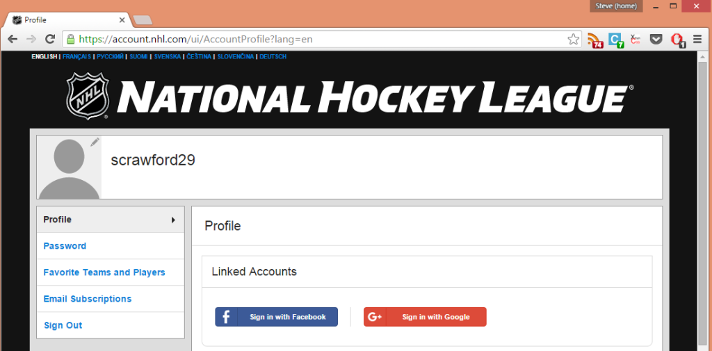
So now that I’ve logged in, I’m at my account profile page. Cool. I update my favourite teams which I didn’t know I hadn’t set and save that. Now what? How do I go back to NHL.com?

How do I go back to NHL.com?
There’s no link. That giant banner at the top? Not a link. -
OK, I’ll go back manually
I throw the cursor up into the old address bar at hack away at it. Changing it from:
https://account.nhl.com/ui/AccountProfile?lang=en
to:
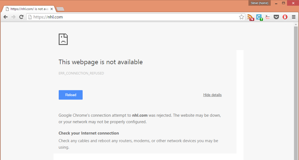
https://nhl.com
Should be good, right? Wrong

Oops Apparently it has to be https://www.nhl.com, otherwise I don’t get anywhere
-
OK, so now I’m back
www.nhl.com gets me where I wanted, so now I’m back where I was before. But…. Am I logged in?
-
Am I logged in? (Part II)
Once again, hovering over my account friend doesn’t tell me anything about whether or not I’m logged in. I click on his little head and….
-
Return to step 4!
So… In summary I like the look of the new site, but it seems they have a bit of UX work to do over at NHL.com.
What have your experiences been like with the new site? Like it? Hate it? Somewhere in the middle? Tweet at me and let me know

